How can you turn a corporate website into a brand experience?
The pharmaceutical group, Pfizer, is facing some major challenges surrounding their complex specialist topics, their broad target groups, and their amount of content. So, how does one create a corporate website that is simultaneously professional, accessible and covers all the necessary information? How do you create a brand experience from pages of dense text? By turning existing website standards on their head.
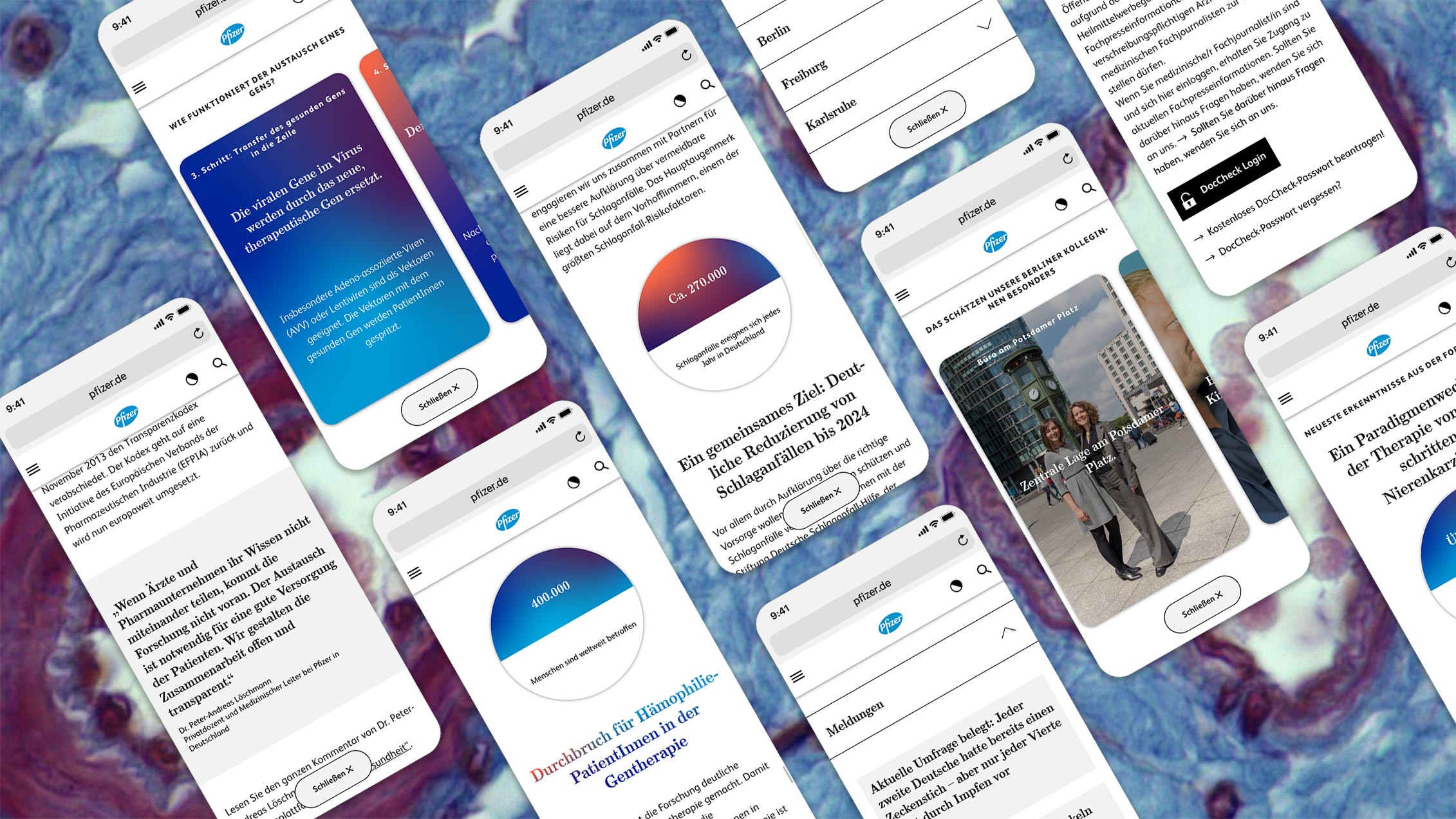
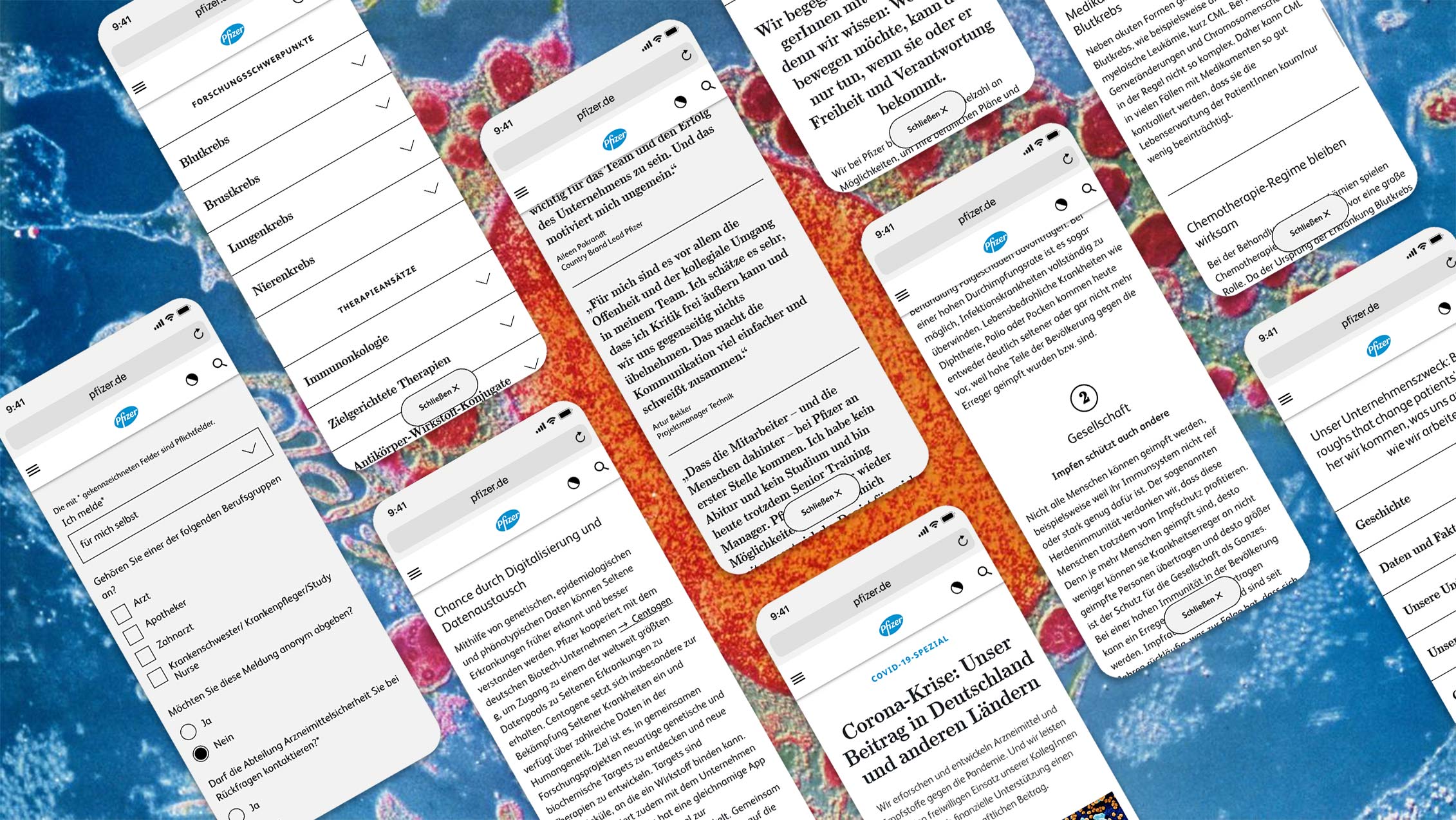
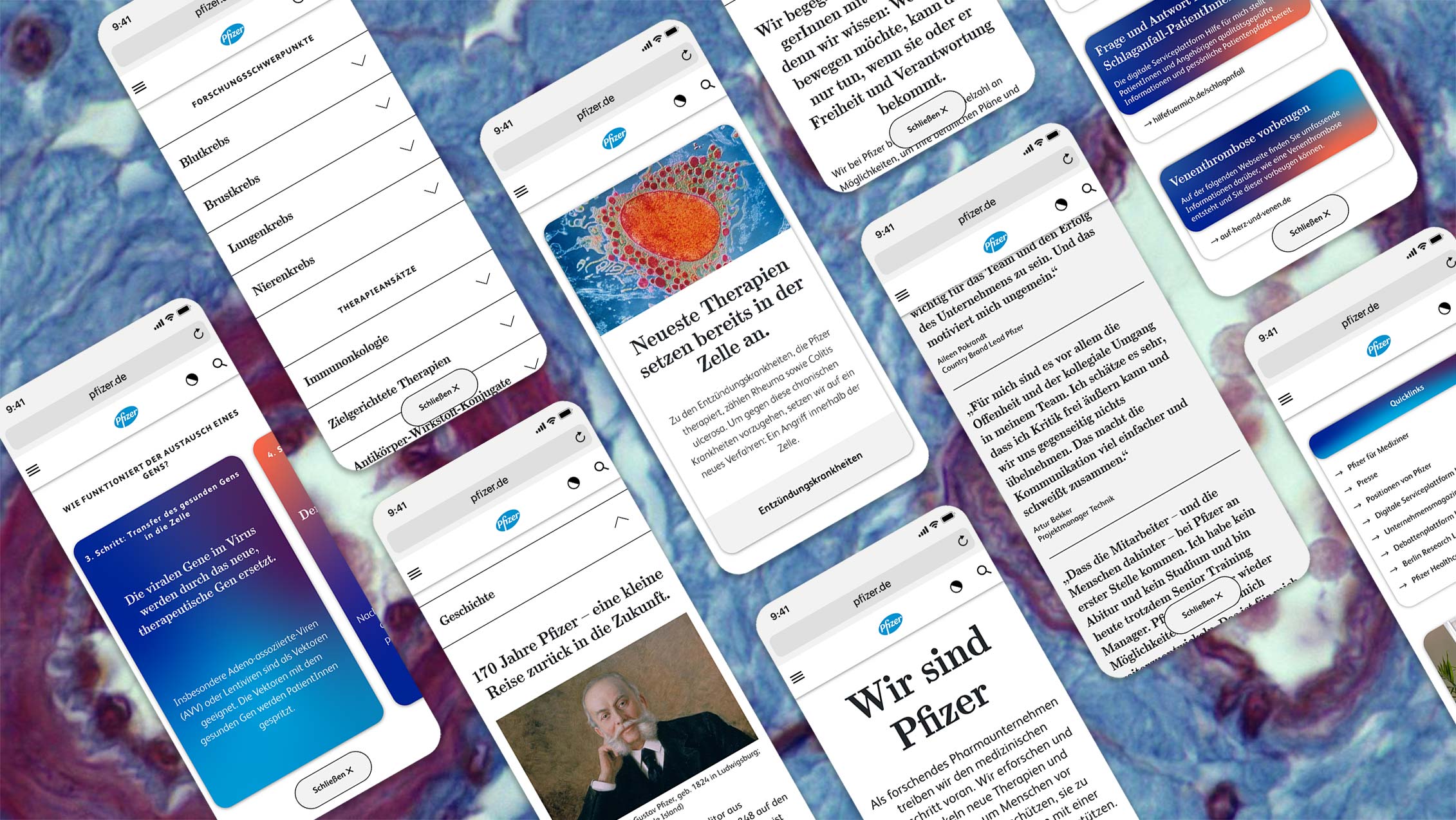
Displaying a lot of content does not necessarily equal displaying a lot of menu points. Instead, we create a website that conveys the most important content as you scroll down, while seamlessly guiding each target group to their destination. Instead of using abstract menu names, we focus on concrete headlines and instead of using navigation trees, we divide the content into small teaser texts. we want to create a brand experience through the user experience instead of conveying the branding just through colours, fonts and graphics. The goal is to keep it simple and tangible, like a social media feed.
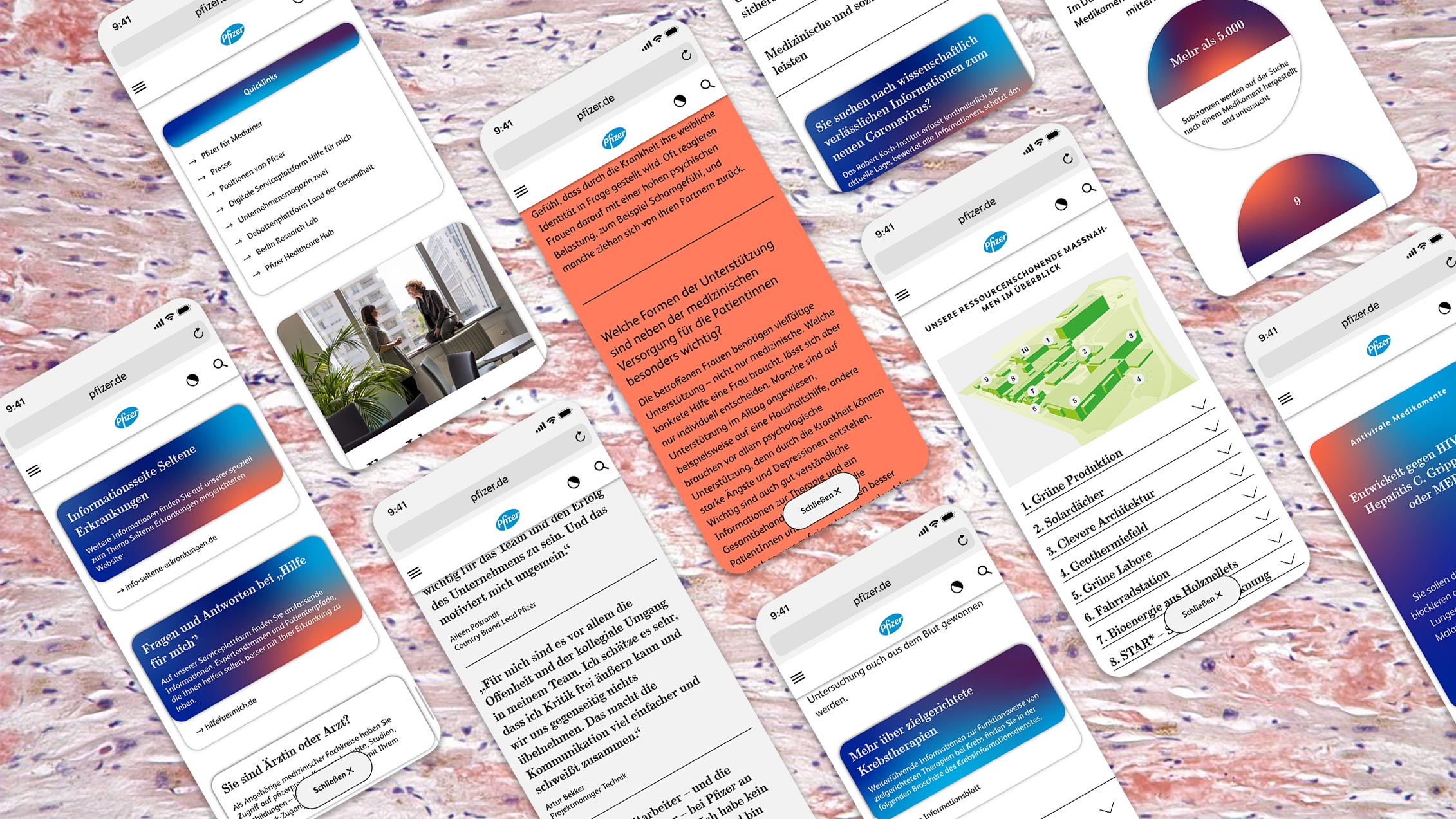
As a pharmaceutical company trying to reach all its target groups, you have to focus on one in particular: the patients. Employees, physicians and the media have distinct search needs, but overall will benefit just as greatly from a comprehensive structure. Patients want to inform themselves, take a look around and get an overall impression. So instead of just making information available with as few clicks as possible, the content can be organized into four major categories. This way, both recurring and targeted users reach each category of content quickly and easily via the menu, which is split into three sections.
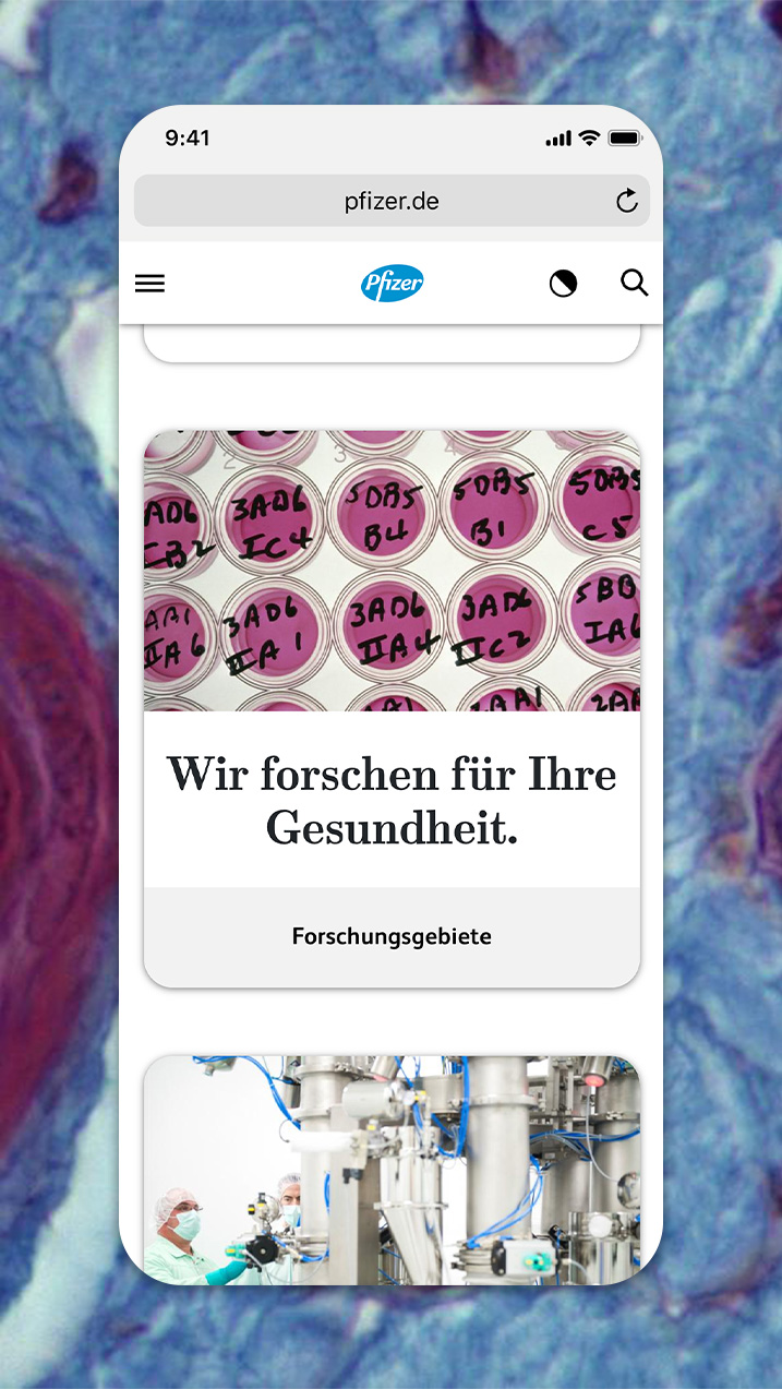
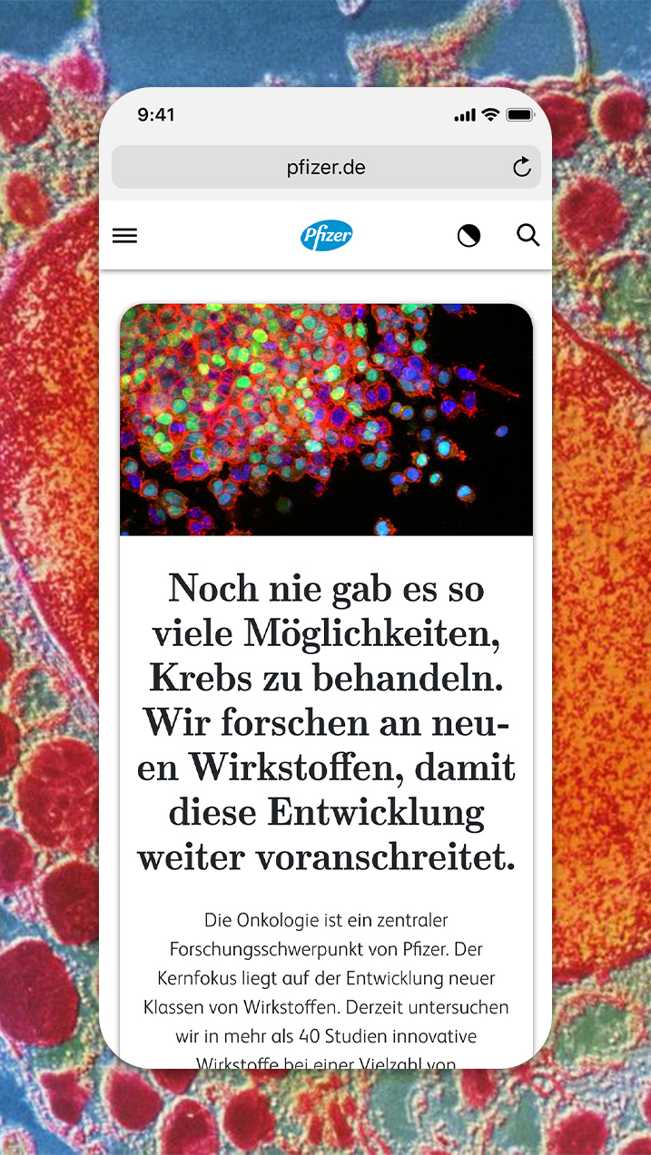
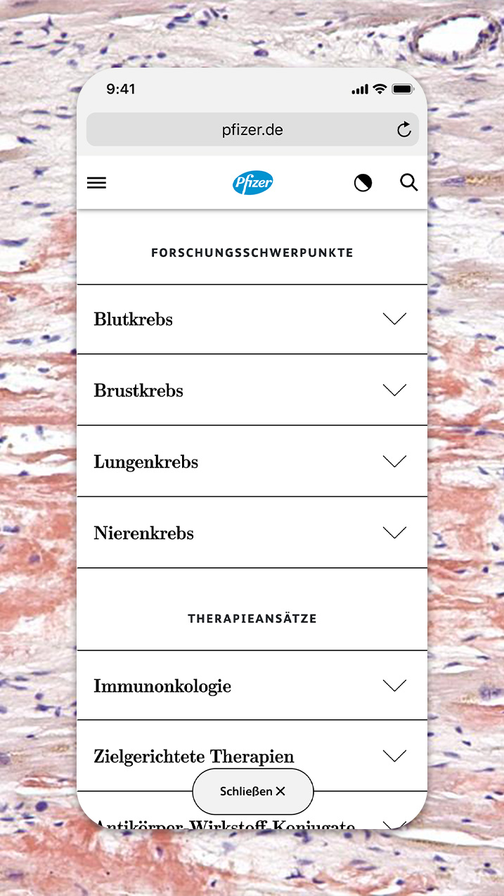
Using context and meaningful headlines instead of generic titles allows for much smoother navigation and draws the user deeper into the site. In areas where more specific information is offered, the site works as a hub to redirect patients, doctors and other healthcare stakeholders to Pfizer Group’s different microsites. The website’s robust structure and modular content formats, allows for continuous growth and expansion without having to change the existing layout.
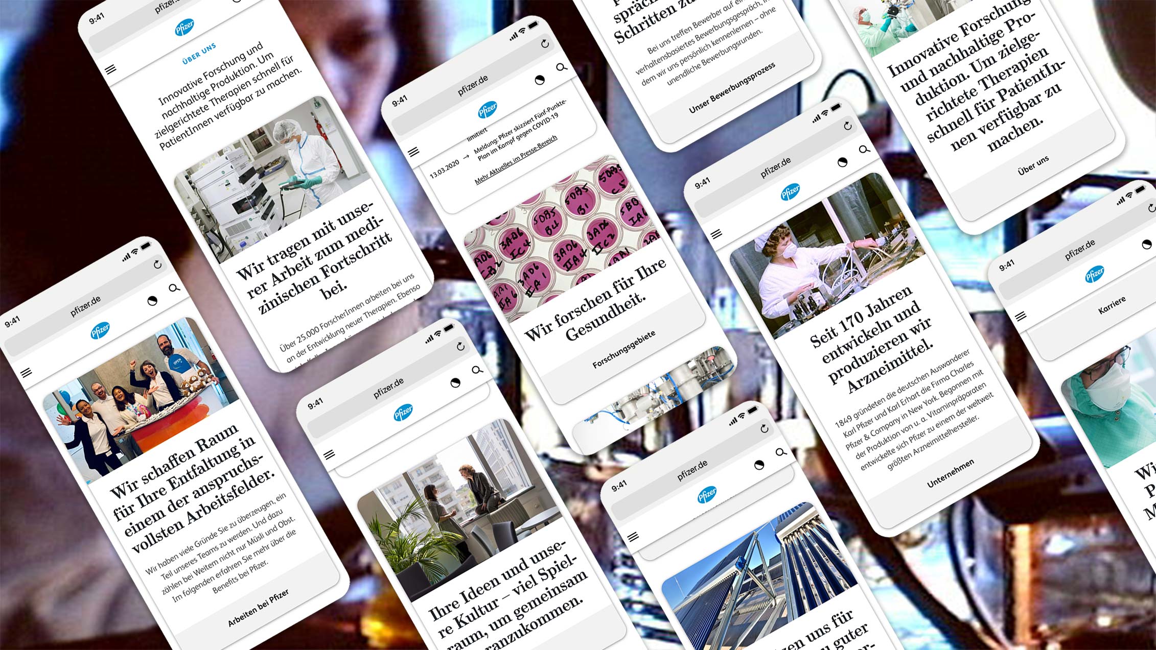
By creating a site for the patients, we ensure comprehensibility across the board, because what a patient understands, any healthcare professional is certainly capable of understanding too. We explain every menu item and every sub-page with insights to provide context and make Pfizer more tangible as a company. When it comes to the visual language, we want to only depict things as they are, whether that be in the office, in the laboratory or under the microscope.
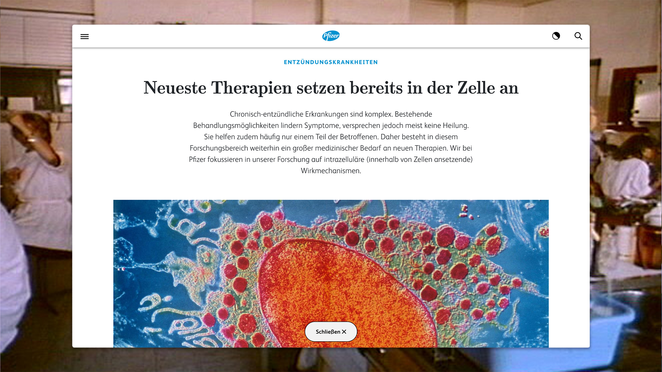
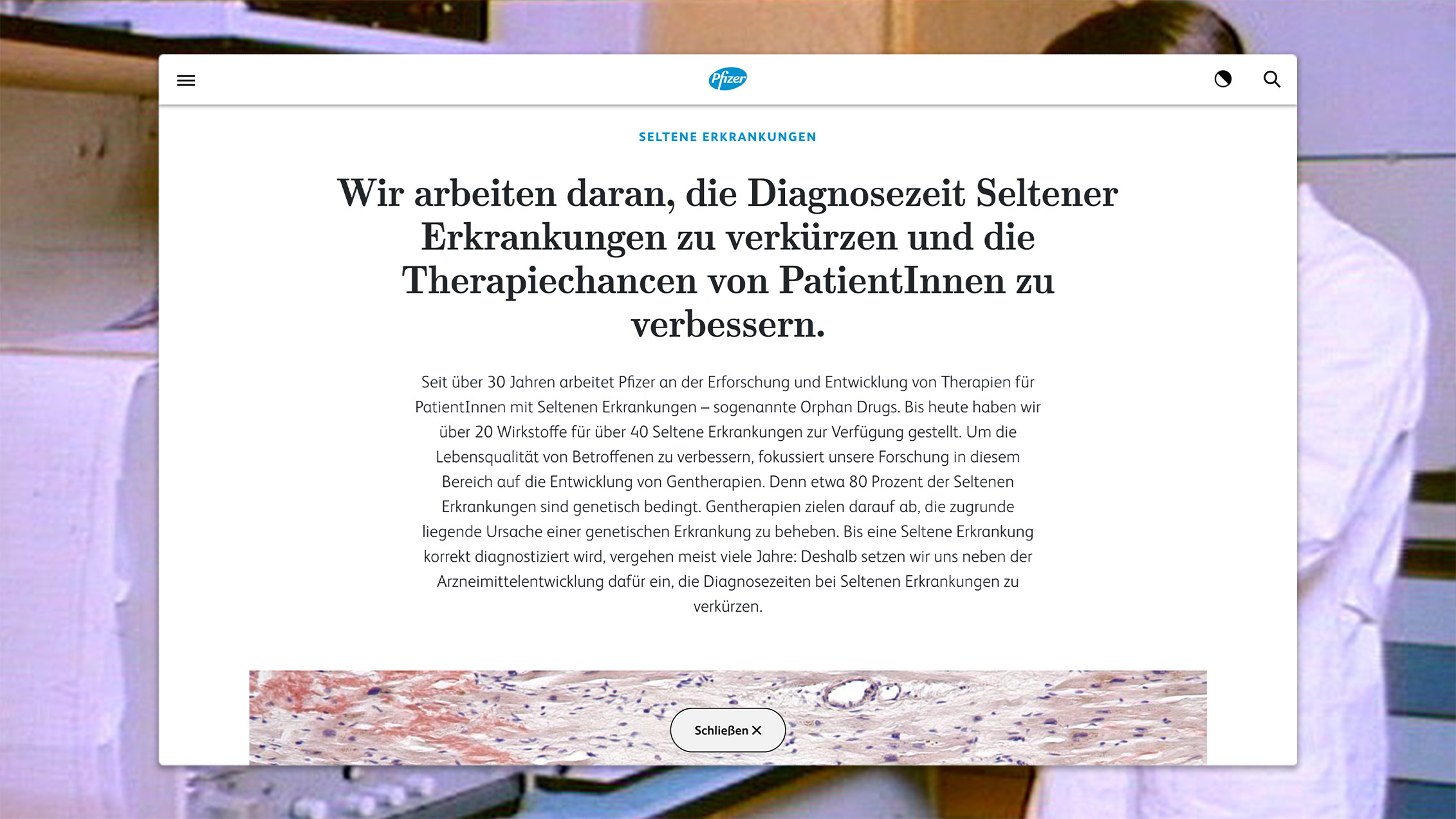
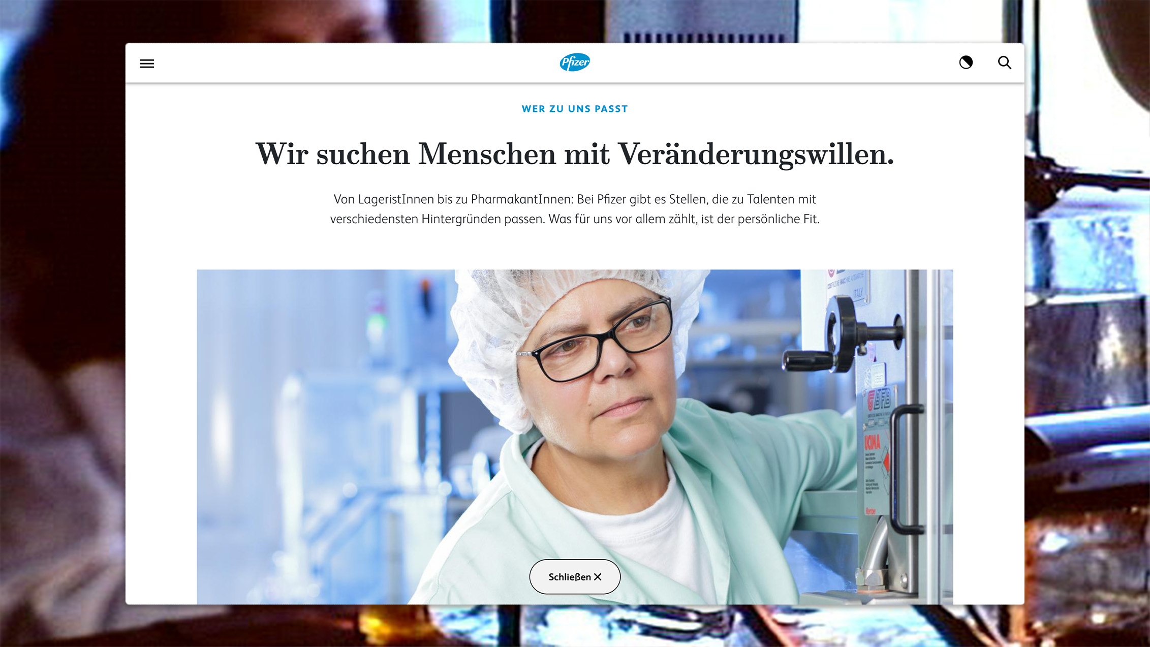
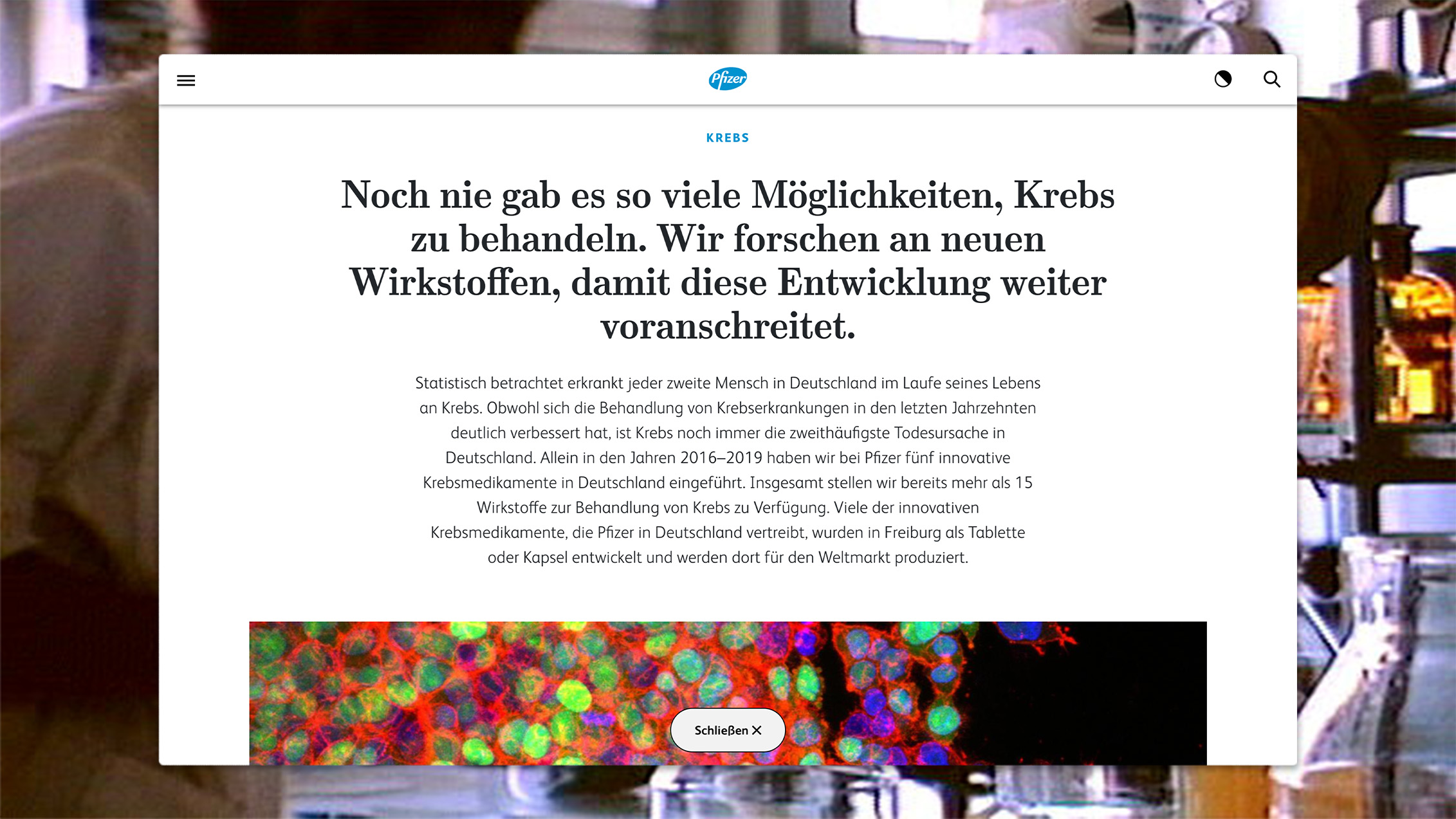
The content is set and we are bringing the Pfizer website into the year 2020 by making it truly mobile first with a modular build, and designed as a complete experience. The content, branding and UX concept all follow the same goal of making Pfizer a tangible, global player in the healthcare sector. We use the site to give real insights into the company instead of self-representations. Our branding adaptation and modular design radically places the focus on the site’s content. Working on the concept, design and content, all at once from the start, really pays off.
